
CLARK MALONE
Turning old and generic into simple and minimalist.

USING BLACK AND WHITE TO STAND OUT
Let's be real. Most plumber websites look downright bad. Filled with colours and strange shapes; they aren't known for being aesthetically pleasing, and all end up looking the same as each other.
Typically, we associate black and white being the colour scheme which blends in - making the website look generic. However through the genius thinking of the Lychee Studios team, we used the black and white palette to stand out from all of the noise, colour and shapes.
By creating a simple, minimalist, black and white website, Clarks website stands out from the rest, and stays blocked in the memory of his potential customers.

Old website
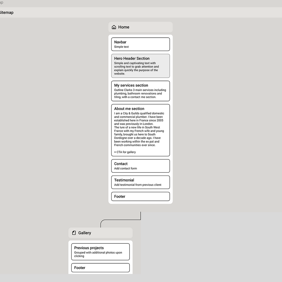
Sitemap
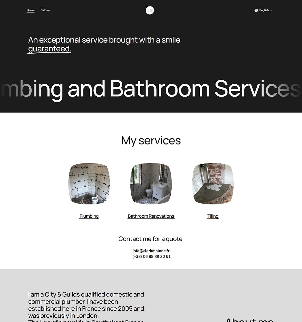
New website

Sitemap
.png)
.png)
DUAL LANGUAGES TO REACH MORE CLIENTS
Being based in a large English-speaking region of France, Clark has a large diversity of clients. Seamlessly incorporating both French and English into his website allows him to reach everyone.
FLUID EXPERIENCE
Navigate effortlessly with intuitive layouts that enhance user engagement and satisfaction.
MOBILE OPTIMISED
Enjoy a consistent experience that maintains aesthetic quality on any device.